Acerca de

Designing a Shoppertainment platform for 10M+ acitve users
What is Shoppertainment?
E-commerce is a well established concept in India and so are engagement apps like Instagram, Snapchat where users primarily log on to consume information. Shoppertainment is a hybrid of the 2 models where the user can consume content and seamlessly transition into a shopping experience.
Users of Shoppertainment
The demographic is varied, as the Glance lockscreen but shoppertainment is primarily focussed on young men and women from tier 2+ cities who aspirational and want to stay up to date on fashion
As users of Roposo came from various backgrounds it was important for the design to focus on users engagement and retention. A large part of reposnisibilty is to ensure that that design process and designs align with the business goals that have been set.


#1 Challenge: Bringing together Shopping & Entertainment
TLDR, Output
Led the conversion of Roposo app from purely a consumption app to a Shoppertainent app clocking 2000+ orders /day in stages to ensure continuous user feedback and business viability
Context
The manadate was to bring together the experience of 2 apps. One purely meant for shopping and another which was used for consuming content. The design teams were also merged who had expertise in both these spaces. So the challenge was in 2 parts
a) Merging 2 experiences and reaching an ideal mid point
b) Merging 2 design teams to ensure the best output and growth
Team and collaborators
3 Junior and senior product designers, 2 UX researchers, 2 UX consultants (when required), 2 Graphic designers. Not all of them were ONLY dedicated to the below case study. There were other pods and one more product.

The importance of a Design Process
When I took over the team, I saw that while each designer was skilled, we lacked a consistent design process. I introduced a structured workflow and aligned it with PMs and EMs to ensure clarity on roles, timelines, and expectations.
The process starts with a kickoff meeting to align on scope and goals, followed by research, ideation, and ideally, early user testing to validate ideas quickly.
Note: This framework is meant for larger features. For smaller tasks (e.g., bug fixes), we skip directly to design and dev handoff based on the kickoff discussion.

Previously, our design process was fragmented and reactive. Despite the designers working hard to meet deadlines, a lack of upfront clarity often led to delays and repeated rework. Product managers had to actively chase down available designers, explain tasks individually, and coordinate informally, making the workflow inefficient.
The Setbacks of the process
-
Operational - Difficulty in estimating the time taken to complete tasks
-
Technical - Lack of clarity on the end goal of a design
-
Psychological - Designers often felt unsatisfied and rushed
-
External - Hiring or onboarding new designers or PM's into the process was cumbersome and seemed like we worked in a hap hazard manner

Setting a direction
Creating a clutter free Flow to help focus Designers while keeping business and user objectives at the centre of things.

Stage 1: Enhancing the existing flow
The initial step was to introduce the concept of shopping with minimum changes to the existing flow and take user feedback. Adding a webpage store between the content and the product description was the approach.
This gave a lot of scope for design ideation (gamifying the store, video + product content) but minimum app changes.
Result: Built awareness among 83% users that Roposo was now starting to sell although popstore as a concept was a failure leading to .25% conversion rates only :(


Pop store Team
1 designer with expertise in content
1 designer with expertise in commerce
1 UX researcher (partial)
1 graphic designer (partial)
"Its overwhelming and I didnt buy because I didnt trust" - Most repeated feedback
Learnings from Stage 1, based on user interviews conducted online and offline
- The pop store was overwhelming and distracting
- Too many things to consume on the page and couldnt decide what to shop for
- Enjoyed engaging with the small games.
Stage 2: Bringing Shopping elements upfront
Now that the concept model was established to some extent, we started building out the experience
Lessons Learnt
- Do not make assumptions that the user is familiar with e-commerce
- Users are visual. Product images make users want to purchase.
- Be mindful on how users perceive entertainment and spending

Result: Conversion rates increased to 24% but funnel still continued to remain small


Ensuring that returns were easy to do and easy to track to ensure trust in the system but the flow also had to ensure that there were fewer fake return.

Learnings from Stage 2, based on user interviews conducted online and offline
- More trust in the shopping expereince was established
"Whats so special? You'll dont have search functionality and i cant find whats "in" either." - most common feedback
Stage 3: Focus on Content
Intestesing insight that came repeatedly from users was that they used social media to understand trends and what is the new thing that was "in" right now. This lead to the next set of explorations to push for further engagmeent and conversions.
Anatomy of Shoppertainment
One of the most challenging pieces for Shoppertainment is identifying and alliging with the the correct North star metrics.
Transactions v/s Engagements
In order for shoppertainment to be successful as a design leader it was important to identify what the experience will truly stand for and these were some questions that helped us understand what we needed to do
-
Will the experience push the user to spend more time but not necessarily transact every time they open the app?
-
Would the experience encourage users to buy immediately or spend time enjoying and consuming content?
-
What will truly bring joy to the user when using the product?
-
Can buying be impulsive but still be time consuming?
-
What is the co-relation between an experience that is engaging and an experience that makes a user want to transact?
-
What will want the user to keep coming back to the experience without a reminder or a push? How do we build a natural and seamless hook?
Content and Transaction focussed pieces of the experience
Semantics of shopping and engagement had to introduced as part of the design language of the app

Content that promotes products

Content that promotes deals and dicounts

Enabling users to navigate using trends
Gamification and engagement focussed pieces of the experience
Keeping the user engaged is important to keep them coming back even. This leads to trust building which is paramount to promote transactions


Increased checkout flow to 89%
Rallied to acknowledge that 99% of our users where comfortable shopping on COD and we could reduce clicks in the process. This led to extreme ease of completing the checkout flow.

Innovating Basic elements of e-commerce
Designing for shoppertainment, presents with the opportunity to innovate on the basic elements of commerce and combine them elements of engagement to create new approaches for existing needs.
Maintaining consistency
Designing for shoppertainment, presents with the opportunity to innovate on the basic elements of commerce and combine them elements of engagement to create new approaches for existing needs.

Collecting user feedback along with every release increased engagement
Set up the UXR plan to collect user feedback and encourage stakeholders to raise requests for feedback with ease.
Identifying user needs, aspirations and alliging those to the business goals is a crucial part of making UXR relavant in an organization


Challenge #2: Organic growth of Roposo app
TLDR, Output
Led the increase of Roposo app having a peak rate of 0.5% and having poor positioning to a peek rate for 4.5% the second highest in the Glance ecosystem (second to news).
Expected funnel for organic growth of Roposo. We create lockscreen cards that lead to downloads of Roposo. The key metric we were targetting for was "Peak Rate". The larger the peak rate, the more users were looking at the content and either converting or building awareness.
Team and collaborators
1 very awesome Product manager and 1 talented and dedicated graphic designer

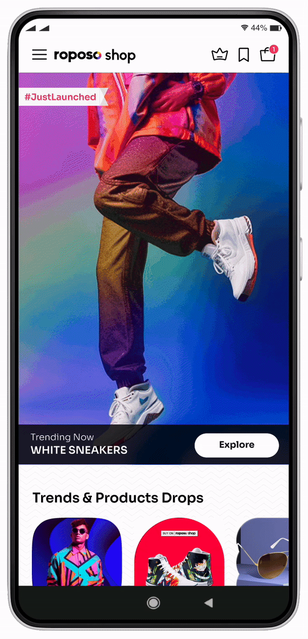
We had to create product Lockscreen that would prompt users to come to Roposo. For example

User Feedback
- Pretty products but not clear who is selling and what should they do
- Not able to connect with these products
"It feels like an ad, im not very interested in ads, i want to look at something that interests me"- most common feedback
Internal stake- holder feedback
- These images are reducing the brand value of Glance and look like we are selling things now.
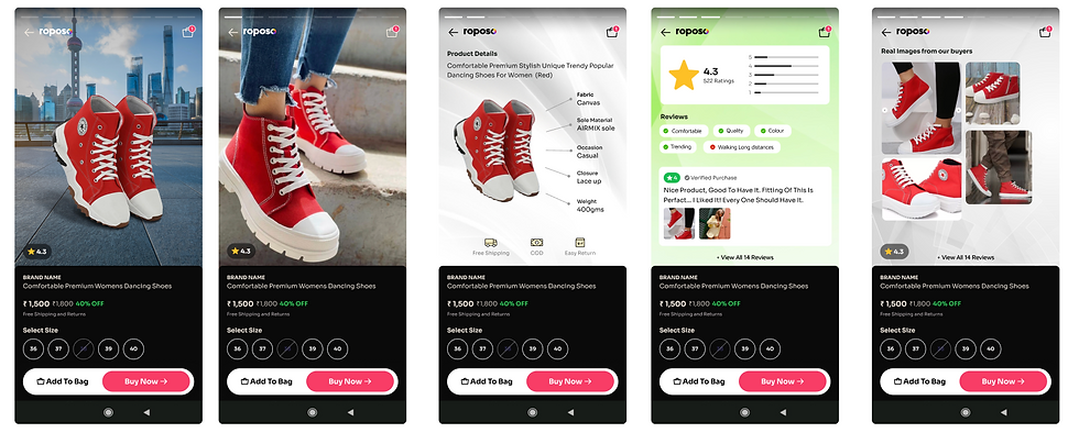
What are the semantics of an ad?
- Price
- Face or Body of model smiling
- Product being the centre of the composition


Blogs felt less like ads that let users come into the Roposo app. This led to another chunk of users coming to Roposo app.


Enabling growth & collaboration as a Design Leader
The importance of a Design Process
When I took over the team, I saw that while each designer was skilled, we lacked a consistent design process. I introduced a structured workflow and aligned it with PMs and EMs to ensure clarity on roles, timelines, and expectations.
The process starts with a kickoff meeting to align on scope and goals, followed by research, ideation, and ideally, early user testing to validate ideas quickly.
Note: This framework is meant for larger features. For smaller tasks (e.g., bug fixes), we skip directly to design and dev handoff based on the kickoff discussion.
Previously, our design process was fragmented and reactive. Despite the designers working hard to meet deadlines, a lack of upfront clarity often led to delays and repeated rework. Product managers had to actively chase down available designers, explain tasks individually, and coordinate informally, making the workflow inefficient.
The Setbacks of the process
-
Operational - Difficulty in estimating the time taken to complete tasks
-
Technical - Lack of clarity on the end goal of a design
-
Psychological - Designers often felt unsatisfied and rushed
-
External - Hiring or onboarding new designers or PM's into the process was cumbersome and seemed like we worked in a hap hazard manner
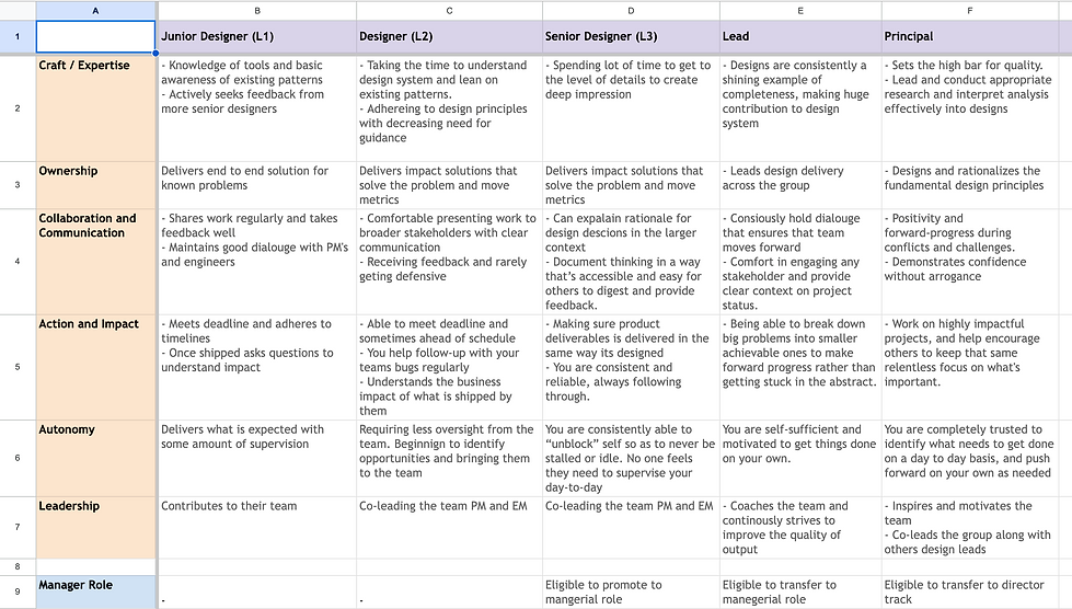
Ownership in Design
Enabling ownership among designers led to higher productivity and energy levels among the design team. I also ensure that designers with complimentary skill sets are grouped together and constantly motivate and improve their craft.
As part of the team mentoring, I also ensured that I invested time getting to know each team member, to not just judge by their current work but by their aspirations. While the roles are often defined, designers often exhibit skills that can be used across projects. So the first step was to understand each team member in depth. Here is a representational image of how i try to understand team members. Apart from core design skills, this also tries to understand individual designers working style, their aspiration so they can be assisted in not just completing their work but are also poised for personal growth.
"Everybody is a genius, but if you judge a fish by the ability to climb a tree, it will live its whole life believing that is stupid". - Albert Einstien
.jpg)

Determining Growth for the design team and ensuring there is a clarity in terms of expectations